'Now I understand' health information
This infosheet about cervical screening was surprisingly fascinating reading.
Over 4 pages, the authors took me from "Ho hum, another health pamphlet" to "I never knew that" to 'Wow! This is so useful to understand."
How did they keep my interest for 4 pages?
Frequent question headings
Everyday language
Lots of space around the paragraphs
Plenty of lists to draw my eye
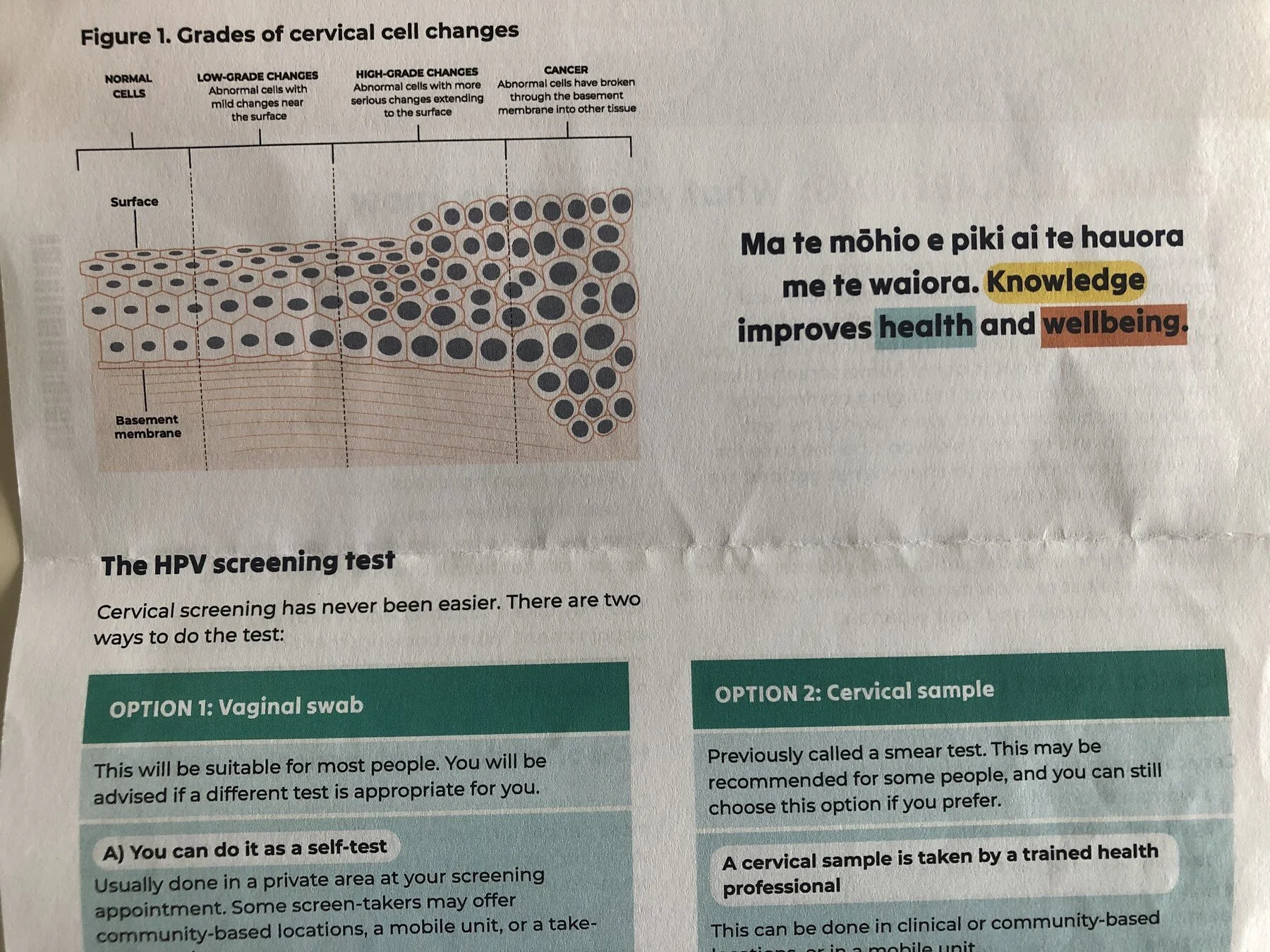
Then they got graphical
A diagram strips colour and detail to focus me on the key points.
Strong design helps me compare two options.
Web version of the information at health.govt.nz