
Presenting incomplete data sets accurately
Kat Greenbrook from Rogue Penguin specialises in data storytelling. (She runs workshops on it – I recommend them!)
In 2020, she thoughtfully presented information about measles
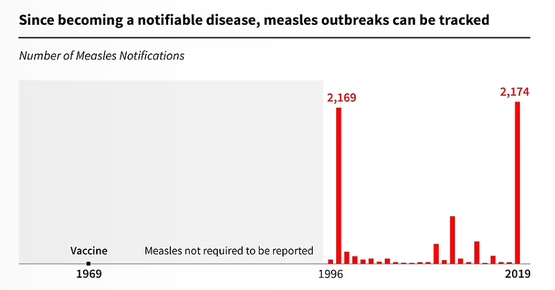
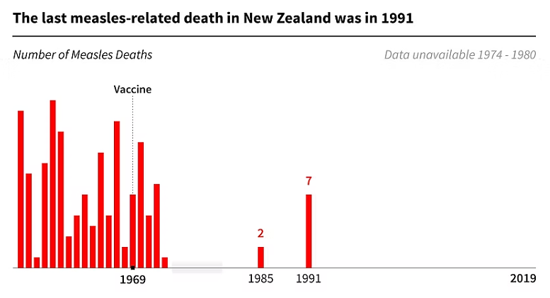
It's an impressive set of information graphics because she had an incomplete data set – and she didn't hide that.
Why the images work
She used grey or blue shading to show gaps in the data
Small notes explain what the shading represents
'Warts and all' makes us trust
We see the available data in context – and we still see the story
It makes us trust the data more because Kat's not hiding anything
Read Measles in Aotearoa on Rogue Penguin's website.
Read Measles in Aotearoa on Rogue Penguin's website.
📩 Sign up for regular writing tips – get new tips direct to your inbox every 2 weeks
↩️ Back to more examples of great writing
✨ Check out my Regulatory Communication workshop — it's for people who tell other people about complying with regulations and laws.
✨ Look into the School of unProfessional Writing to learn about plain language at your own pace