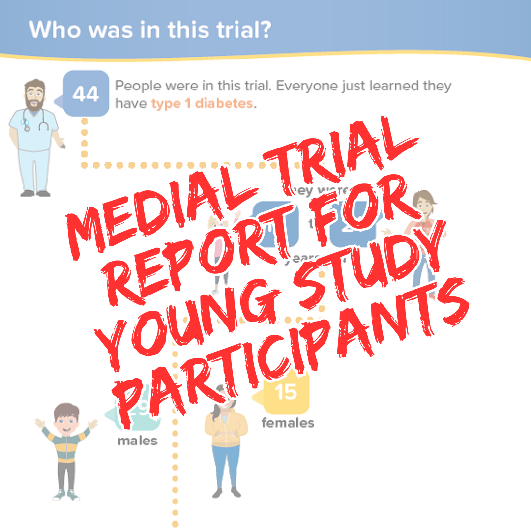
Imagine you're 15 years old and just learned you had type 1 diabetes. You agree to participate in a Europe-wide clinical trial.
Months after the trial, you receive a report with the results. Incredibly, you can understand it!
Health Literacy Media & Novartis Pharmaceuticals Corporation created this visual-heavy report for young trial participants.

I've never seen this before. I've wanted to, but I never have.
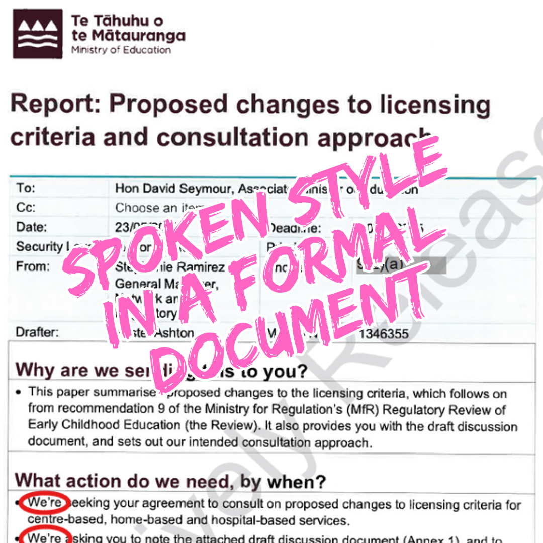
In a briefing to David Seymour, the Ministry of Education uses contractions (we're rather than we are).
Formal situation. Spoken language.
Nobody freaked out.
No one complained about being disrespected.
The minister circled 'Agree' to all the recommendations.
The text is precise, formal, AND it uses contractions.
Finally! Proof that the only reason we keep writing formal documents in a stuffy, heavy style is that we believe we have to.
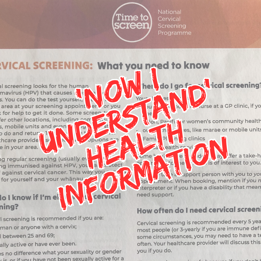
This infosheet about cervical screening was surprisingly fascinating reading.
Over 4 pages, the authors took me from "Ho hum, another health pamphlet" to "I never knew that" to 'Wow! This is so useful to understand."
How did they keep my interest for 4 pages?
Frequent question headings
Everyday language
Lots of space around the paragraphs
Plenty of lists to draw my eye
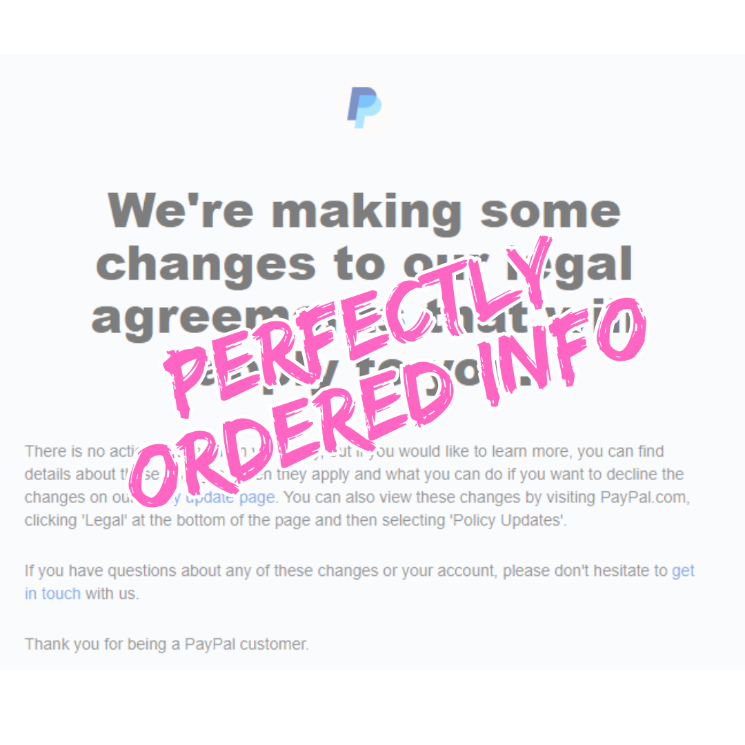
This email from Paypal does everything right structurally.
Bottom line up front
Paypal's clever communications staff know many customers won't open a mass email, so they put the bottom line (the main point) in the subject:
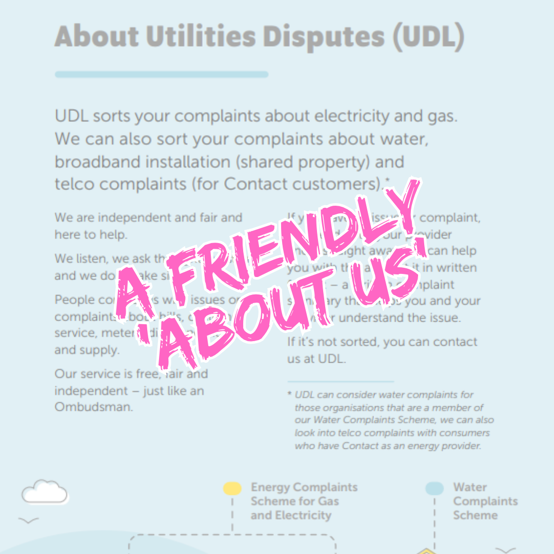
This pamphlet from Tautohetohe Whaipainga Utilities Disputes explains what they're about in a few clear paragraphs.
They write like they speak
They've chosen language that comes across as approachable and supportive.
Notice how quickly they switch from "Utilities Disputes" to "UDL" to "We".
The reader is "your" and "you" from the start.
The page is well spaced and the graphic supports the text.
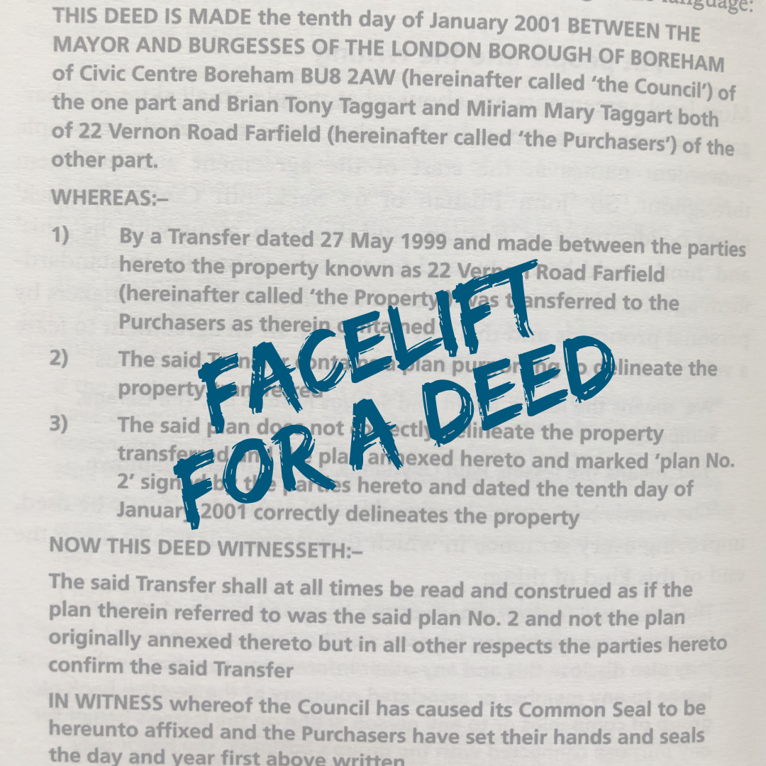
In the classic Oxford Guide to Plain English, Martin Cutts rewrote a deed of amendment (second edition, pages 180 and 181).
Here's the original
Can you guess what issue they were amending?
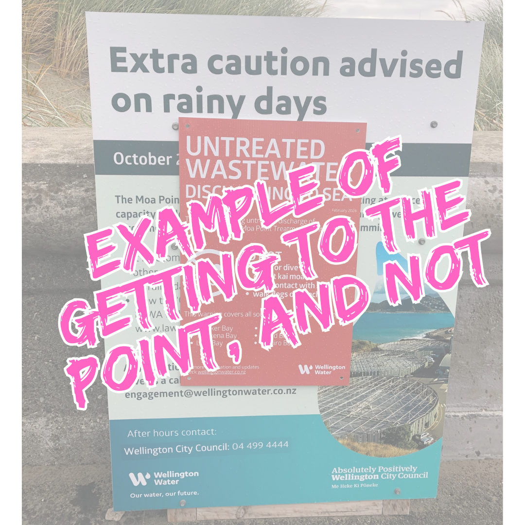
The first poster has been up in Lyall Bay, Wellington, for months now. It was made when there was a sewage problem but not a sewage disaster.
The point is hidden, especially from someone walking past and only glancing at the poster.
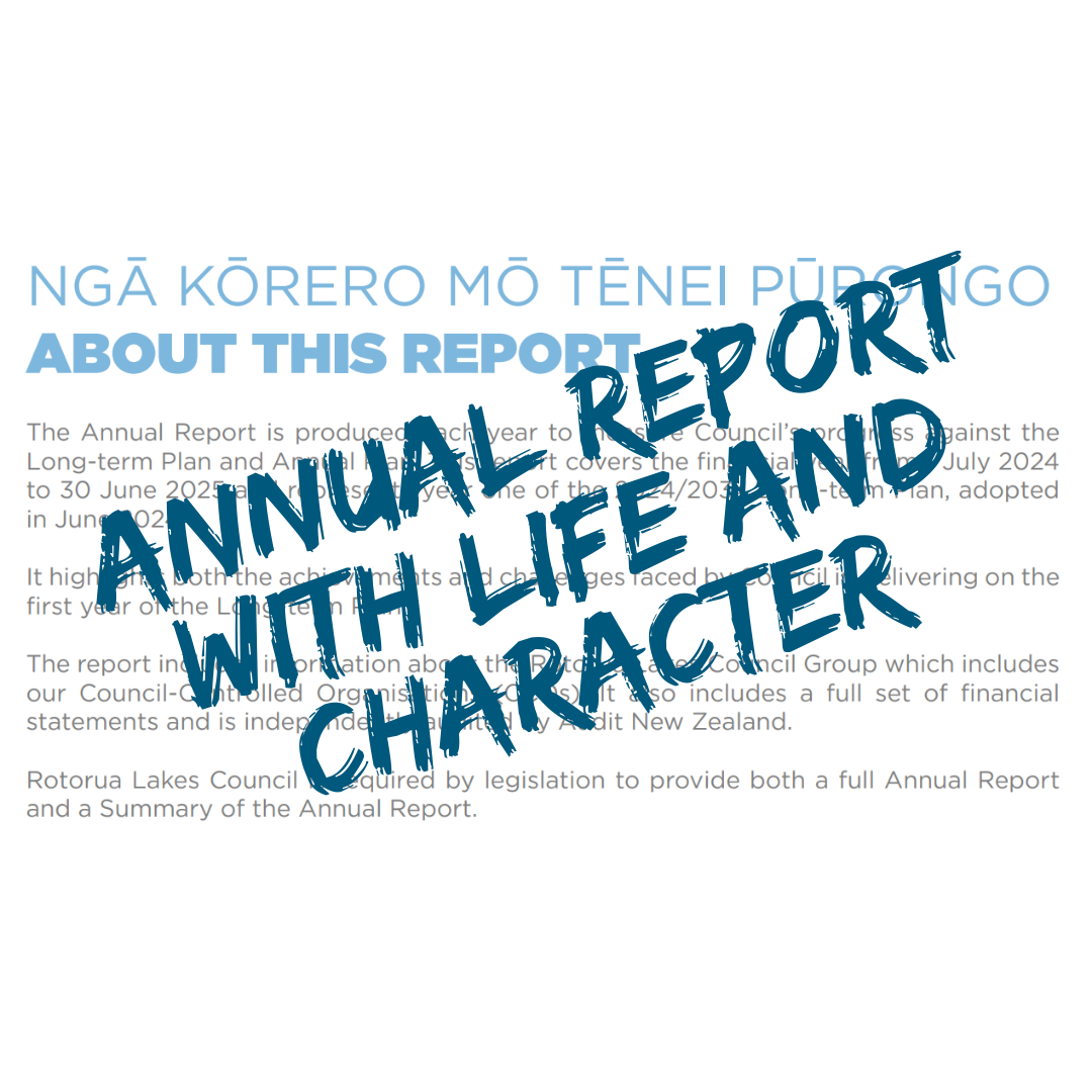
I was impressed by the Rotorua Lakes Council's Annual Report 2025.
Reports this big are written by many people. Despite this, there's a sense of collective identity in the report.

Dr Nicolina Newcombe has published a chapter of her PhD thesis. She's called the publication Models of disability in Aotearoa New Zealand.
You should read it for two reasons:
1. It's educational.
2. She has a great writing style.
Check out this excerpt of her introduction, where she builds idea upon idea, easily taking you along for the ride.

When you're overwhelmed with grief, you can't take in screeds of advice. In fact, straightforward information is the only kind that will stick.
The wonderful people at Manaaki Tāngata Victim Support understand this.
How they made this doc work
They refined everything they could say down to a few core messages on coping with grief.
Those messages could have been crammed onto one page but were spaced over two.
The sentences are short and the words are simple.
These choices help the messages stick.

KidsHealth is a fantastic plain-language resource for parents.
It deserves its spot as a finalist in the Awards' Best Plain Language Website — Private Sector category!
Classic inverted pyramid structure
Big-picture content comes first; details later.
This means parents can skim quickly through the info to find the bits that are relevant for them.

Palmerston North City Council has cleaned up their webpage on parking fines.
It's a finalist for the Best Plain Language Turnaround at this year's Awards, the category for documents that have been overhauled for readers.

The Ministry of Education made this year's shortlist for Best Plain Language Document — Public Sector with this Awards entry.
I loved the approach to the contents page of their document.
33 of the 34 headings are questions
I'm a mum. I'm interested in my daughters' privacy at school, and these questions mirror my own. Ka rawe!

Turns out that picture of a country garden belonged to someone who didn't want it on Pinterest. Oops.
The writer doesn't make a mountain out of a molehill
They put the bottom line up front in the subject line, and then again in the email itself.
They say what they're there to say quickly and clearly.
This email also works because it's:
polite – 'sorry'
approachable – 'we' and 'your'
conversational – 'we're getting in touch'.


I was lucky enough to judge the USA ClearMark Awards this year, and was assigned to the apps category.
This app blew me away. I'm so pleased it won!
Show me for Emergencies on the app store

I like the:
clear title
informative subtitle
sensible 'before, during, after' navigation
action-oriented statement headings
short paragraphs with simple words
link to info you might want to read next

Here are two excerpts from the Plain Language Awards 2022 winner of the legal documents category.
I love that MAS commits to using we, you, and they
And because it's 'not that simple', a little further on, they define the three roles you and they might have.
To draw attention to the important information, MAS uses:
colour
shaded boxes
numbers
Notice that MAS doesn't use:
all caps
the heading IMPORTANT NOTICE

Imagine you need to learn about resident withholding tax. Cringe!
Not an exciting topic, but Inland Revenue does a great job of making the must-know information crystal clear on its website.
Love you, Inland Revenue!