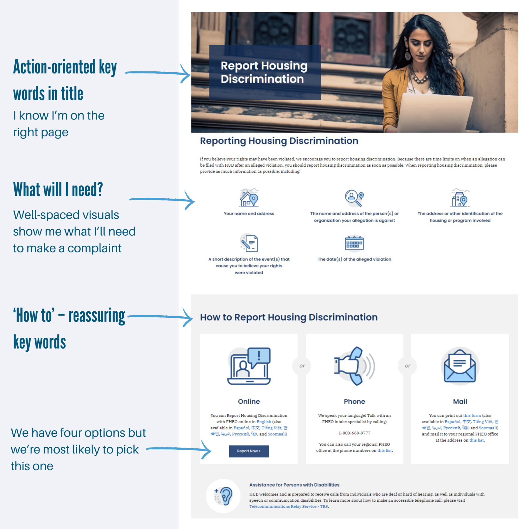
Webpage designed for skim readers
This webpage is designed so you notice the:
keywords in the headings
icons surrounded by white space
action button in dark blue
This page gives us 4 ways to make a complaint, but…
The option that’s cheapest for the Department to administer comes first and has a big dark button. We're more likely choose it.
📩 Sign up for regular writing tips – get new tips direct to your inbox every 2 weeks
↩️ Back to more examples of great writing
✨ Check out my Clear and Concise workshop, where I’ll train your team reader-focused writing.
✨ Look into the School of unProfessional Writing to learn about plain language at your own pace